Ex-libris and Typography
Hasip Pektaş
Ex-libris is an effective and important means of communication with the pictorial and typographic elements it has. The picture and writing used in Ex-libris symbolize its owner, due to the fact that it describes its own period, it’s a historical document. This type of art, which differs according to aptitudes and social environment, is like the mirror of the period in which it is created. It reflects the cultural characteristics of its period with its form, typographic and calligraphic structures.
Writing is one of the basic elements of communication. It is the latest form of symbols and signs used by primitive societies. These forms can express a feeling, an idea or a life with the strong meanings they bear. Sometimes a word can be replaced with millions of pictures and vice versa. While picture leaves a mark with the intensity of feelings it creates on the viewer, writing is effective both with its meaning and its way of presentation. Letters and writing has an important place in human life. The process that began with the invention of printing machine have reached the utmost level with the computer age and today typographical choices have increased with the development of writing.
Typography includes the formation of writing within a system, its arrangement and printing process. Proper and easy communication is up to the facilities of typography. There are many rules and many methods of application of the rules in typography. Choice of fonts, internal and external spaces of letters, their proportion to each other, background and value relations are important factors in perception.
We see writing in two different positions in Ex-libris. It is either in the picture together with it or only the typographic and calligraphic elements turn into a visual form and Ex-libris is formed. The writing element should display a balance whether it is in the picture or used alone. These words (Ex-libris and the name and surname of the person for which Ex-libris is made), which are a part of the visual show, cannot be thought separately from the picture. Its position, direction and dimension in the picture should be well determined. A great difference between the sizes of the letters or the words being written with different characters deteriorates unity. When writing overshadows the picture with its structure or color or when it is too small to read, the effect of Ex-libris is weakened. If the writings within the Ex-libris are not placed in their suitable place, the equilibrium is destroyed. The inaccordance between writing and picture negatively affects the overall unity and composition of the picture. A misapplication of writing, loss of balance between the closed and open spaces of letters turns Ex-libris into a more complex thing. Therefore bold characters are read with more difficulty compared to light characters. One of the most important factors that facilitates reading is the balance between the inner spaces of letters and the spaces between the letters. It is hard to read an “a” or “u” which does not have proper inner space. Writing and picture must be in accordance.

Karol Felix, Slovakia, C3+C4+C7, (116x78), 1989
Since they are a kind of coat-of-arms, a sign of property for the individuals, Ex-librises can also be made only with typographic and calligraphic arrangements. These symbols made by writing the names in original forms or arranging the initials of names in a specific way resemble a logo. Thus the desire for creating an identity specific to that individual comes to foreground. In this respect it is a must that the Ex-libris is an original creation. There is no image in this phase. Letters are the images; their strength, weight, rhythm, equilibrium between their sizes, color and nature will form the Ex-libris. Each Ex-libris, be it produced with the help of a computer or the enrichment of drawings in calligraphy, will be different from the other in that letters become visual images. Creating a style in typographic or calligraphic Ex-librises, as in painting, is up to the creative efforts and research of its designer. The balance between the black spaces that compose the letters and the untouched areas, the accordance with each other shall both facilitate perception and increase visual aspects.

Hannu Paalasmaa, Finland
Today, in addition to serving as a sign of possessiveness, Ex-libris has become a branch of art that creates opportunities for the artists to express themselves, their feelings and thoughts. Ex-librises that are produced with aesthetic explorations will reach the future. The increase in the aesthetic appreciation of the Ex-libris artist depends on long research, good analysis of structures and of course working hard.

Julian Dimitrov Jordanov, Bulgaria, C3+C5, (128x94), 2002

Martin R. Baeyens, Belgium, CGD, (40x130), 2001

Evgenij Bortnikov, Russia, X2, (82x72), 1999

Lieven Deconinck, Belgium, CGD, (70x70), 2003

Özden Pektaş Turgut, Turkey, CGD (65 x 80), 2002

Bosiljka Kcevac, Yugoslavia, X3, (90x62), 1994
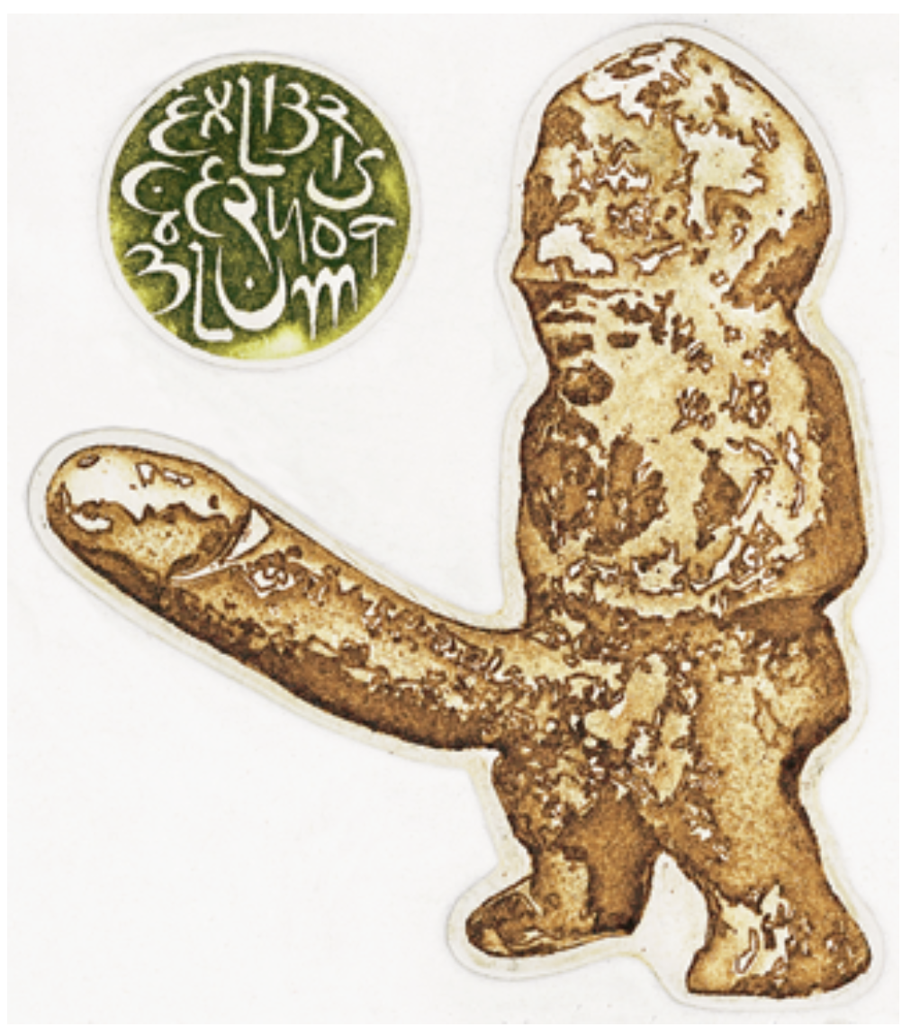
Hasip Pektas, Turkey, C3+C5, (88x77), 1999

Selin Sobaci, Turkey, CGD, 2002

Hiç yorum yok:
Yorum Gönder